
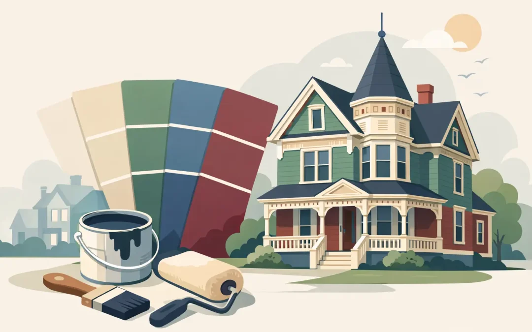
A Victorian home can carry three, four, or even five exterior colors without looking busy – but only when every shade has a clear job. That is why choosing the best paint colors for Victorian homes is less about finding a single favorite swatch and more about respecting the architecture, the setting, and the condition of the surfaces beneath it.
For Pittsburgh-area homeowners, there is another consideration: Western Pennsylvania weather. Deep shade, summer humidity, freeze-thaw cycles, and long wet seasons can all affect how exterior paint holds up. A well-chosen palette should bring out the home’s craftsmanship while working with a professional preparation and painting process built for the long haul.
Start With the Home’s Architectural Details
Victorian homes were designed to be noticed. Brackets, spindlework, fish-scale shingles, bay windows, porch columns, corbels, decorative gables, and wide trim all create opportunities for contrast. The mistake is treating every detail as though it needs its own color.
A strong exterior palette usually has a field color for the main body of the house, a trim color for windows, corners, and fascia, and an accent color for smaller architectural features. A fourth color can work well for doors, porch ceilings, shutters, or ornamentation. On especially elaborate homes, a fifth color may be appropriate, but restraint still matters.
Before choosing colors, step back across the street and look at the house as a whole. Small details that seem prominent from a ladder may disappear at curb distance. The main goal is to create definition, not visual noise.
Best Paint Colors for Victorian Homes: Classic Palette Ideas
The right Victorian palette depends on the home’s original style, surrounding neighborhood, roof color, masonry, and your own comfort with contrast. These combinations offer a dependable starting point without forcing a period-perfect look.
Sage Green, Cream, and Deep Burgundy
Sage green is one of the most forgiving Victorian body colors. It feels historic without becoming overly formal, and it works especially well with Pittsburgh’s mature trees, stone foundations, and brick walkways. Pair it with a warm cream on major trim and deep burgundy on the front door, porch rail details, or selected brackets.
This palette suits homes with generous porches and detailed woodwork. Avoid a bright or yellow-heavy cream, which can make green appear muddy. A softened ivory or light tan is usually more balanced.
Dusty Blue, White, and Charcoal
A muted blue body with off-white trim offers a clean, classic appearance that still has Victorian character. Charcoal or nearly black accents can define window sashes, shutters, and porch details. This combination works well when the roof is gray, black, or slate-toned.
The trade-off is maintenance. Very light trim shows dirt and mildew more readily, particularly on porch railings and shaded elevations. High-quality paint and proper washing, scraping, sanding, priming, and caulking help keep the finished work looking clean longer.
Warm Gray, Soft White, and Black
For homeowners who prefer a more restrained exterior, warm gray is an excellent main color. It complements stone and brick, works with many roof colors, and gives ornate trim a quieter backdrop. Soft white trim and black accents create enough contrast to show the architecture without turning the home into a patchwork of color.
Choose a gray with brown, taupe, or green undertones rather than a sharp blue-gray. In Western Pennsylvania light, cool grays can feel colder than they appeared on a small paint chip.
Rich Red, Tan, and Forest Green
A deep brick red or barn red can be striking on a Victorian home, especially one with a simple rectangular shape or substantial clapboard siding. Tan or cream trim keeps the color grounded, while forest green can add depth to doors, shutters, or decorative gable elements.
Red needs careful testing. Strong sunlight, shade, and nearby red brick can all change its appearance. Sample it on more than one side of the home before making a final decision.
Deep Navy, Putty, and Copper-Inspired Accents
Navy is a strong choice for homeowners who want a traditional color with a more tailored appearance. A putty, light taupe, or soft gray-beige trim prevents the contrast from feeling too stark. For accents, consider a muted copper, dark rust, or aged bronze tone rather than a bright orange.
This palette is particularly effective on homes with white or gray stone foundations. It also gives porch columns and elaborate gable trim a crisp, finished look.
Use Historic Color Ideas, Not Rigid Rules
Victorian homes were not always painted in the dark, heavily ornamented color schemes people associate with the era. Color trends changed throughout the late 19th and early 20th centuries, and many houses have been updated several times since they were built.
If your home is in a historic district, review any local requirements before selecting exterior colors. Some districts have guidelines for visible elevations, trim, doors, or masonry. If there are no restrictions, you have more flexibility to choose a palette that suits your home and neighborhood.
A faithful historic approach can be beautiful, but it is not the only good approach. A simplified palette in historically compatible shades often delivers the best result for a family home. It preserves the building’s character while making future maintenance more manageable.
Consider the Roof, Brick, Stone, and Landscape
Paint does not exist by itself. The roof may be the largest color on the property, and it is expensive to change. A brown roof generally works with warm greens, creams, taupes, and muted reds. A charcoal or black roof offers more freedom and pairs well with blue, gray, green, red, and white palettes.
Brick and stone are equally important. Do not select a trim white before checking whether the mortar or stone has a warm gray, beige, or pink undertone. A bright white can clash with older masonry, while a softer off-white may look intentional and polished.
Landscaping also changes the view. A home surrounded by dense evergreens may need a lighter or warmer body color to avoid disappearing into the background. A sunny lot can handle deeper colors, though dark paint on south- and west-facing surfaces may fade faster and show surface movement more readily.
Test Colors Where They Will Be Seen
Paint chips are useful for narrowing choices, but they are not enough for a Victorian restoration. Buy sample containers and paint large test areas on different sides of the house. Include a section of siding, trim, and an accent detail if possible.
Look at the samples in morning sun, afternoon sun, overcast conditions, and after dark with porch lights on. Pittsburgh’s cloudy days can make colors look several shades deeper, while direct summer sun can bring out unexpected undertones.
Keep the samples up for a few days. The color you like immediately is not always the one you will want to see every day for the next decade.
Preparation Protects the Color Choice
Even the best palette will fail if paint is applied over loose coating, open joints, wet wood, or chalky surfaces. Victorian homes often have layers of old paint, weathered trim, and hard-to-reach areas where moisture has caused damage. These are not cosmetic details. They affect adhesion and the life of the paint job.
Professional preparation should include a close inspection of siding and trim, surface cleaning, removal of loose or failing paint, sanding where needed, repairs to damaged areas, proper priming, and careful caulking. The exact process depends on the substrate and condition of the home. Wood clapboard, cedar shingles, old porch railings, and previously painted masonry all require different treatment.
This is also where an experienced painter can help simplify a complicated color plan. The Pittsburgh Painting Company has worked on large homes and Victorian restorations since 1978, with the detailed preparation and clean jobsite practices these properties require.
Do Not Forget the Front Door and Porch Ceiling
The front door is the easiest place to add personality without committing the entire exterior to a bold color. Deep red, navy, black, forest green, and rich teal all work well with traditional Victorian palettes. The right choice should relate to an existing accent color rather than introduce a completely unrelated shade.
A porch ceiling deserves attention, too. A pale blue can feel classic and welcoming, while a warm white or soft cream keeps a covered porch bright. If the porch is low, dark, or shaded by trees, avoid a ceiling color that makes it feel more enclosed.
A Victorian home earns its appeal through detail, but a successful paint job makes those details feel organized instead of overwhelming. Take time to test colors, account for the fixed materials around the house, and give preparation the same attention as the final coat. The result should look right from the sidewalk, hold up through Pittsburgh seasons, and make coming home a pleasure.
Recent Comments